I ranked mobile gesture-based navigation systems, and the iPhone is still winning
In 2017, Apple introduced gesture-based navigation for iOS on the iPhone X, and kick-started the trend of phones offering this functionality in place of software buttons. One and a half years later, the option to use gestures to get around your phone‘s interface instead of buttons is available on the majority of handsets today.

Now, given how diverse the Android ecosystem is, you’ll find a range of different methods for implementing these navigation gestures among various phone brands. And that’s alright, because you might prefer one system over another. Having tested several phones’ gesture controls over the past few months, I thought it’d be fun to rank them from most usable to least usable.
My ranking is based on my usage, observations, and conversation with friends who’ve used their phones for long enough to point out their pros and cons. My exhaustive tests take into account ease of use, how long it takes to get used to a gesture system, and how intuitive it feels. Let’s go!
Top notch: iPhone
Home: Swipe up from the bottom center
Back: None
Recent apps: Swipe up and hold from the bottom center
Switching between apps: Swipe left-right on the bottom (just like three-finger swipes on the MacBooks)
For the last couple of years, I’ve used an Android phone as my daily driver, and an iPhone as a secondary device. But last year, after the release of the iPhone XS, the roles were reversed. The Apple device’s smooth-as-butter navigation gestures – and the Pixel 3’s XL’s clunky approach to navigation (which I’ll describe later) – prompted the switch. Apple’s system felt intuitive and had an easy learning curve. In contrast, the Pixel 3 XL’s system is a confusing and cumbersome system.
Apple has even improved responsiveness for each of its navigation actions in iOS 12. Even after using the device for nearly six months, I haven’t experienced any lag or stutter with any of the gestures, and getting around the interface feels delightful. The update also streamlined the process for dismissing apps. Earlier, with the iPhone X, you’d have to swipe up and hold to bring up the recent apps menu, and then long press to start removing apps. Now, you can just swipe them away after reach the recent apps screen.
The best of Android: OnePlus
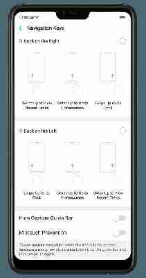
Home: Swipe up from the bottom center
Back: Swipe up from the right or left bottom edge
Recent apps: Swipe up and hold from the bottom center
Switching between apps: Scroll through apps after reaching the recent apps screen
OnePlus first introduced gestures in the OnePlus 5T back in 2017. While it wasn’t the most polished implementation when it first arrived, the actions were intuitive enough. Over a couple of iterations, the company has enhanced the responsiveness of gestures on OxygenOS. For instance, going to the recent apps menu by swiping up from the bottom center of the screen and holding is quicker and easier than before.
I like this system because, with one-handed usage, the bottom part of the phone is the easiest to reach. Now, other companies like Samsung, Vivo, and Oppo have a similar system as well. However, on these other brands, the swipe up action from either left or right (depending on your choice) will open either the control center (Vivo) or recent apps (Oppo and Samsung). I prefer OnePlus’ way, which skips this complication.


Sure, why not?: Xiaomi / Huawei
Home: Swipe up from the bottom center
Back: Swipe in from the right or left edge
Recent apps: Swipe up and hold from the bottom center
Switching between apps: Scroll through apps after reaching the recent apps screen
I don’t have major issues with the gestures these two brands use, However, having the back button on the bottom feels much easier than having it on the edges of the screen. If I’m using the phone with one hand, I have to adjust my grip a bit to make the swipe gestures from either edge, and I’d rather not have to fumble with the device that way every time I want to return to my tweets from a browser tab.
Plus, in apps like Twitter or Gmail, you can open the side menu by swiping from the left edge. To do that with this system, I have to reach out to the top left of the screen and swipe from there. You could probably get used to it, but it’s hardly comfortable.
Hell no!: Google Pixel 3 XL
Home: Tap the center pill on the bottom center
Back: Tap the back button from the bottom nav bar
Recent apps: Swipe up from the bottom center
Switching between apps: Hold the pill icon in the bottom nav bar and scroll
This one’s about as awkward as a dude skulking in a corner at a party. Google’s vision didn’t really hit the mark in the first go. In both previous Pixel phones, it was easy to access the app drawer by simply swiping up from the bottom. Now, because of the new navigation system, you have to either swipe up twice, or keep swiping up from the bottom till you see the app drawer. More often than not, you’ll find yourself stuck on the recent apps menu when trying to do this.
Also, who needs an always-visible back button if you’re trying to adopt a gesture-based system? Thankfully, recent reports suggest that the back button might be going away entirely in the next version of Android.
While Google’s tried the iPhone-like system of scrolling on the bottom bar to switch between apps, the action is not as smooth as with Apple’s approach. And overall, the Pixel gesture system is harder to get used to than the rest.
There you have it: Apple takes the top spot with its gesture system, while Google brings up the rear. What’s your favorite approach to gesture navigation? Let us know in the comments.
TNW Conference 2019 is coming! Check out our glorious new location, inspiring line-up of speakers and activities, and how to be a part of this annual tech bonanza by clicking here.
