Canon Ixus 1100 HS review
The Canon Ixus 1000 HS was one of our favourite cameras of 2010. Its 10-megapixel sensor, 10x zoom range and 1080p video recording were a great combination of features, and the resulting photos and videos were the best we'd seen from a big-zoom compact camera.

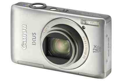
Canon isn't one to rest on its laurels, though, and the 1100 HS bears little relation to its nominal predecessor. The sensor is now 12 megapixels and the lens has a 12x zoom, giving some useful extra extension at the wide-angle end to deliver a 28-336mm range. Its dimensions are marginally smaller but it's actually a little heavier, and the 1000 HS's rounded off corners have been filled in to give a blockier appearance. Still, at just 22mm thick it'll slip into any pocket. There's only a small improvement to battery life, though, which now stands at 170 shots. That might not be enough for a day's use, particularly if the 1080p video mode is used extensively.
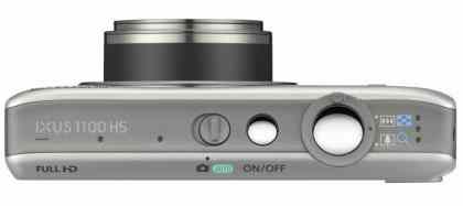
The biggest changes are on the back of the camera, with the 1000 HS's 3in screen, buttons and wheel replaced by a 3.5in touchscreen. The remaining buttons are for power, shutter release, zoom, playback and a switch to choose between Auto and other shooting modes – the switch has just two positions so all other modes are selected via the touchscreen controls. There's not even a dedicated video capture mode or a dedicated record button, but the latter is always available as a touchscreen button.

The widescreen 16:9 aspect ratio isn't the most obvious choice for a camera that takes 4:3-shaped photos, but Canon uses the blank strips either side of the preview image to display various on-screen buttons. Meanwhile, tapping the preview image itself moves the focus point, engages track focus or focuses and takes a picture, depending on the selected menu option.
Sadly, this smart use of the touchscreen runs dry when browsing the menus, which display options as a scrolling list in the same vein as the button-operated Ixus cameras. For touchscreens, a grid of buttons is much easier to operate that a scrolling list. We initially found menu navigation painfully slow, and although we got better at it with practice, it never felt entirely comfortable. Because the menu options don't all fit on the screen at once – and because they can change depending on the selected mode – locating a particular function often involved looking for it rather than jumping directly to it.
The 1100 HS also committed a cardinal sin by sometimes failing to respond clearly to our input. It powered up and took a photo in 3.3 seconds, but powering up and responding to touchscreen prods took 4.5 seconds. Pressing the screen a little earlier produced an audible beep to show that it had registered our finger but nothing else happened.
